Tuesday, April 29, 2014

Final Project Process

When Michael assigned the final project I had no idea what I wanted to do. He gave us free reign, allowing us to choose anything we wanted, as long as it included certain tools. I thought about it for a while, and after coming up with nothing, I decided to take a break and do art history homework at The Brooks Museum. While there, I went into the gift shop and looked at the cards available there. I really liked them because they were done in an artistic style that was completely different than the cards in Target or Walgreens. I decided I wanted to make my own cards, that were more unique and cute. I began my research in the best way; looking up pick up lines. I wrote down about fifteen or twenty and decided on my favorites. I drew rough sketches of the designs and scanned them into the computer.


Once that was finished, I brought it into photoshop. I began erasing using the rectangular marquee tool, to erase large chunks of the background. I once again used the rectangular marquee tool to fill the background with a bright color, that way I could see what areas were erased and which were not.

 I erased other parts using the magic wand tool, and the smaller areas were erased by simply using the mouse. I also used the adjustment layers to make my outlines stronger, and more bold. I attached it to the layer underneath it so that the background color didn't dim down. I also used a layer mask on certain adjustments.
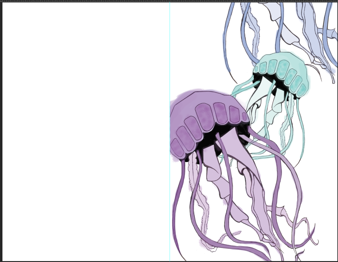
I then used burn and dodge to lighten and darken areas (more specifically in the jellyfish design). I needed the lines to be very dark and sometimes I gave highlights. I then opened it in a new file, with a line dividing it evenly so that the front would be the front and images wouldn't run over. On the jellyfish card, I copied the image into a new layer, scaled it down and flipped it horizontally so it faced the opposite direction.  I then used the clone stamp tool on the jellyfish closest to the picture plane to add one more fish.
                           

I then colored them in purely in photoshop. I used a watercolor brush stroke to add a hand drawn look. 
I then took off the layer that had the outline on it, leaving just the brush strokes. I added a quick pickup line and saved it as the inside of the card.


Tuesday, April 22, 2014

Whats up with that final?

Greetings everyone, it's time for finals. In digital we were given free reign on what to do as long as we used certain tools in Photoshop. I've decided to make greeting cards. I plan on using really cheesy pick up lines and other sorts of fun things.

Tuesday, April 15, 2014

The Life of a Hermit

When I first started this project, I wanted to draw my icons by hand and paint them in Photoshop. I began with an idea that involved a balance beam and weights on it to symbolize the things that take up most of my time. Once I walked around the class and met with Savannah and Toonky I realized that my idea was very disconnected and didn't feel personal. To change that I answered the simple question of "what do I spend the most time doing?" Well… I sleep or hibernate 38% of my time, but a bed would be too simple so I decided to build a blanket fort and put things inside it that represent my life. I didn't want to just draw the fort so instead I built a fort and photographed it myself. I then took the photo into Photoshop and began editing it. I drew the pen tool around an object (starting with the computer) and increased the feather radius to 3. I then clicked on hue and saturation and played with the levels until I found a color that suited the object. I repeated the process until every object I needed was a separate color. I then drew a banner using the pentagon tool. I copied that shape again and added a black stroke to it. I added text to it centering it. I then drew a black rectangle with the rectangle tool and wrote the categories of my time in corresponding colors to the objects. For the most part I really like the image, I'm just not happy with the black side panel. I want it to look more like an inforgraph and I'm not sure how to do that. I didn't like this project that much though, honestly I thought it was boring.

Tuesday, April 8, 2014

Info graphic Feedback

In class today, we broke up into groups and gave feedback for the first drafts of the info graphic projects. When I brought mine forward, I was unhappy with the appearance of it. I had tried to take the route of scanning sketches into Photoshop and going over them with the pen tool. I also realized, my concept was not as personal as everyone else's. In order to remedy this, I brought my problem up to my group of Toonky and Savannah. Savannah suggested I change the idea to a bed setting and using the pillows to represent the activities in my info graphic. She explained how my current project had a nice composition, but it looked like time was baring down on me, and it was unpleasing. She also suggested I use certain objects to represent my activities, such as a dumbbell for working out. I liked her ideas, but I wasn't sure about the bed idea. We all agreed that sleep was a big part of my schedule so I wanted to keep the theme and decided a blanket fort would represent my personality more. Although I like to relax and sleep, I like to explore and make things and I thought this was the perfect representation of that. Toonky suggested I use books to represent work-study and pillows for sleep, things like that. The idea was to keep these items inside the fort. He also recommended I use greyscale to help bring out my chosen icons. I looked at info graphs that I liked and decided I would use bright colors to bring out the objects that were icons. Overall this feedback was really great, and helped me progress with ideas.