Friday, May 2, 2014

Artist Lecture: Jill Wissmiller

4/17/2014
Jill Wissmiller is well known for her current portraits made out of glitter. She is the head of the digital media department in Memphis College of Art. Although she is well known for the glitter portraits, she began with shorts and movies. In her lecture, she talked about her short films/scenes that she's done. Boots showed how important anger is. The audio in this short was hard to hear and understand. Hair Horse was about how women cannot control their lives, so they control their hair. Jill had never directed humans before this, so directing herself was the first step. Tiny Hatchet Hidden in Muff was about a different kind of anger. It implied violence. The short was unsuccessful because there was too much reading involved in it. There was a back story about what lead to the short that lost the viewer. It took too long to read and digest. Welcome to Cooksville was a feature screen play that had been shot in only four days. In those four days, she managed to kill off all of her characters in the story. The film had too much excess, she tried to cram too many things into one film. This made the film loose sight of what it was trying to do. The film had no soul, but Wissmiller said that it taught her a lot as a director. She then went on to the eight different article types, the different kinds of columns one may see in a magazine. She demonstrated these through shorts.
The Quiz was the first article type, and she choose to focus on "Do you love your breasts?" The short consisted on a little girl grinding the breasts off of a Barbie doll on the sidewalk. The little girl was trying to make the doll look like herself. The Quick Fix Way to Improve Life Enforcement article translated into a girl who thought her boyfriend was cheating on her. In order to make him love her, she does a bunch of voodoo tasks in order to fix the relationship. Jill didn't cover every article, but they both were interesting.
In closing she talked about her glitter works. She choose a guy from her high school, and had him dance in a cowboy hat. She also had her good friend Lily think about a love gone wrong. It turned into projecting the image onto a glitter surface.

Final Project: Carson Cards

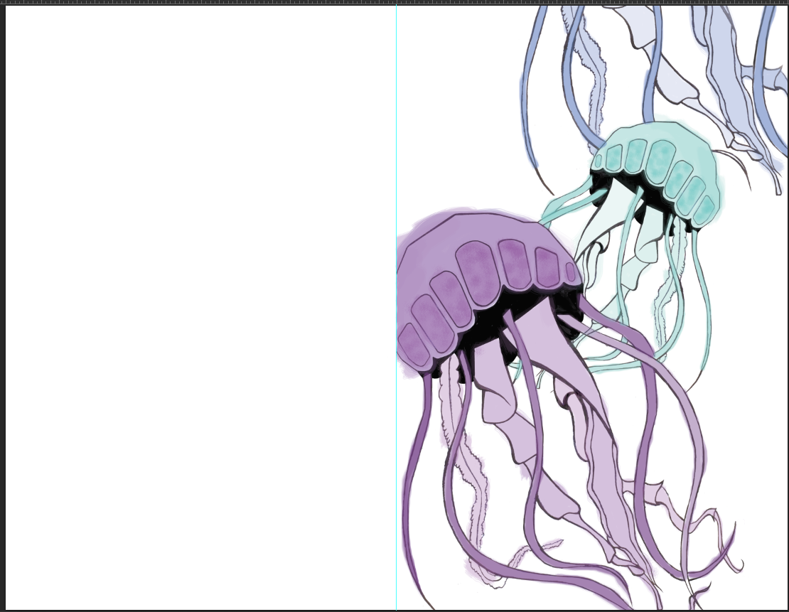
For the final project, I was allowed to choose any project I wanted to work on, as long as it included certain tools. Wanting a break from all of the conceptual mundane projects, I chose to create something just for fun; greeting cards. I began by researching pickup lines and sayings. Once I choose a few, I illustrated them and scanned them into Photoshop. I cleaned up the outlines and colored them separately. I decided I wanted to put the watercolor like strokes on the inside of the card without an outline. On some of them, not all, I wrote the pick up line on the inside of the card interacting with the design itself. The shark card is the only one that is without a pick up line on the inside since it is in the shark’s mouth. The cards are about control. When making the outlines for the cards, I had to be careful in making the outline clean. When it came to coloring the cards, I let go and didn't worry about coloring outside of the lines. The two of them together create a balance that relates to the final days in the digital class. It relates to how important it is to have control and
determination in your life but how you also need to live and have fun. I feel like the outlines, the color, and the subject matter all communicate this idea. I feel like each design is successful on it’s own, but it looks even better together; as a series. Three of the cards are marine animal related, while one is unrelated. The ice cream was meant to confuse viewers. The piece relates to control and letting go.


Tuesday, April 29, 2014

Final Project Process

When Michael assigned the final project I had no idea what I wanted to do. He gave us free reign, allowing us to choose anything we wanted, as long as it included certain tools. I thought about it for a while, and after coming up with nothing, I decided to take a break and do art history homework at The Brooks Museum. While there, I went into the gift shop and looked at the cards available there. I really liked them because they were done in an artistic style that was completely different than the cards in Target or Walgreens. I decided I wanted to make my own cards, that were more unique and cute. I began my research in the best way; looking up pick up lines. I wrote down about fifteen or twenty and decided on my favorites. I drew rough sketches of the designs and scanned them into the computer.


Once that was finished, I brought it into photoshop. I began erasing using the rectangular marquee tool, to erase large chunks of the background. I once again used the rectangular marquee tool to fill the background with a bright color, that way I could see what areas were erased and which were not.

 I erased other parts using the magic wand tool, and the smaller areas were erased by simply using the mouse. I also used the adjustment layers to make my outlines stronger, and more bold. I attached it to the layer underneath it so that the background color didn't dim down. I also used a layer mask on certain adjustments.
I then used burn and dodge to lighten and darken areas (more specifically in the jellyfish design). I needed the lines to be very dark and sometimes I gave highlights. I then opened it in a new file, with a line dividing it evenly so that the front would be the front and images wouldn't run over. On the jellyfish card, I copied the image into a new layer, scaled it down and flipped it horizontally so it faced the opposite direction.  I then used the clone stamp tool on the jellyfish closest to the picture plane to add one more fish.
                           

I then colored them in purely in photoshop. I used a watercolor brush stroke to add a hand drawn look. 
I then took off the layer that had the outline on it, leaving just the brush strokes. I added a quick pickup line and saved it as the inside of the card.


Tuesday, April 22, 2014

Whats up with that final?

Greetings everyone, it's time for finals. In digital we were given free reign on what to do as long as we used certain tools in Photoshop. I've decided to make greeting cards. I plan on using really cheesy pick up lines and other sorts of fun things.

Tuesday, April 15, 2014

The Life of a Hermit

When I first started this project, I wanted to draw my icons by hand and paint them in Photoshop. I began with an idea that involved a balance beam and weights on it to symbolize the things that take up most of my time. Once I walked around the class and met with Savannah and Toonky I realized that my idea was very disconnected and didn't feel personal. To change that I answered the simple question of "what do I spend the most time doing?" Well… I sleep or hibernate 38% of my time, but a bed would be too simple so I decided to build a blanket fort and put things inside it that represent my life. I didn't want to just draw the fort so instead I built a fort and photographed it myself. I then took the photo into Photoshop and began editing it. I drew the pen tool around an object (starting with the computer) and increased the feather radius to 3. I then clicked on hue and saturation and played with the levels until I found a color that suited the object. I repeated the process until every object I needed was a separate color. I then drew a banner using the pentagon tool. I copied that shape again and added a black stroke to it. I added text to it centering it. I then drew a black rectangle with the rectangle tool and wrote the categories of my time in corresponding colors to the objects. For the most part I really like the image, I'm just not happy with the black side panel. I want it to look more like an inforgraph and I'm not sure how to do that. I didn't like this project that much though, honestly I thought it was boring.

Tuesday, April 8, 2014

Info graphic Feedback

In class today, we broke up into groups and gave feedback for the first drafts of the info graphic projects. When I brought mine forward, I was unhappy with the appearance of it. I had tried to take the route of scanning sketches into Photoshop and going over them with the pen tool. I also realized, my concept was not as personal as everyone else's. In order to remedy this, I brought my problem up to my group of Toonky and Savannah. Savannah suggested I change the idea to a bed setting and using the pillows to represent the activities in my info graphic. She explained how my current project had a nice composition, but it looked like time was baring down on me, and it was unpleasing. She also suggested I use certain objects to represent my activities, such as a dumbbell for working out. I liked her ideas, but I wasn't sure about the bed idea. We all agreed that sleep was a big part of my schedule so I wanted to keep the theme and decided a blanket fort would represent my personality more. Although I like to relax and sleep, I like to explore and make things and I thought this was the perfect representation of that. Toonky suggested I use books to represent work-study and pillows for sleep, things like that. The idea was to keep these items inside the fort. He also recommended I use greyscale to help bring out my chosen icons. I looked at info graphs that I liked and decided I would use bright colors to bring out the objects that were icons. Overall this feedback was really great, and helped me progress with ideas.

Saturday, March 29, 2014

Info Graphics

I choose this info graphic because I liked the layout of the graphic. I liked how big the illustrations were, but they still provided information. I like how large the title is, it grabs my attention and let's me know exactly what's going on. The most appealing thing about the image is the photos. They're very informative and the perfect way to present the information on this subject. The reader can actually see how the dance moves should look. The way the information was presented was what first got my attention, but the information itself is fun. I didn't expect to find such a fun info graphic. I think the graphic is very clear and helpful.


I selected this image because I really liked the colors involved in it. I think the graphic has a nice flow and organization to it. The information was appealing because of the way it looked. I didn't care much about the subject but I thought it looked really nice. The first thing that attracted me to the poster was the color, specifically the yellow title, the light blue of the "36% of consumers drink craft beer" and the glasses of beer themselves due to the gradient. I think the colored dots under the drinks become slightly confusing though.


I selected this graphic because the cleanliness, the alignment, and clarity of the image. The simplicity of the image appeals to me, along with the color and clarity. A person could just glance at this graphic and understand what it was about. I was first attracted to how the image looked, the color grabbed my attention. I also liked how this one was more simple. The information is interesting, but it came second. 


I chose this graphic because of the clarity, craftsmanship, and alignment. I really enjoy how they stick with the same glass to represent the type of drink. The colors are appealing as well as the fonts chosen. The way the graphic was presented grabbed my attention more than the information did. I found it interesting that the type of drink was related to a personality. I like how for each sub-category the pattern that the text is laid out in changes so the audience can connect it to the main category, but can still distinguish it. 


I chose this graphic because of the clarity in the information presented, the craftsmanship, alignment/spacing, and visual hierarchy. The photos included are appealing, the different fonts, and information are as well. When I first saw this graphic, the information appealed to me more than the graphics. The graphics are very eye catching but the information related to my personal life so it caught my eye more. I like the way it gives more information in places to help the reader dive more into the topic, but if they aren't interested it's not in the way and doesn't disrupt the flow.